Web design can be made or broken on simple rules like attractiveness and being responsive to the user’s screen, but these must be combined with the right tone, the audience in mind, and the polish to pull-off the attempt. Here are 3 great websites that we can’t get enough of, and why we think you’ll love them too.
1. UNICEF/MOON
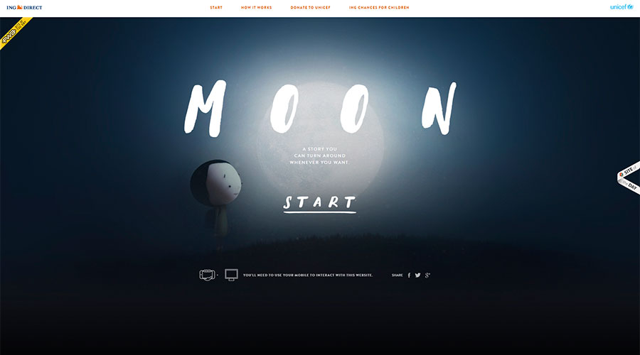
This innovative, enticing website not only has a purpose that is not immediately clear – it makes you want to find out what that is. A fairly obvious starting point for a breakdown of the design is the now-common full-width imagery, a large heading and a lack of clutter, but there is much more to this site than the opening screen. I’m debating whether to tell you how it works or let you see it for yourself. Yeah, I’ll let you experience it yourself. Just know that if someone had told me about it before I saw the site, I probably would have had two minds about doing it. But when you’re on the website itself there’s a certain intrinsic pull of adventure. A brilliant design backed up by a perfectly pitched message, giving users a reason to interact across multiple devices.
2. PACK
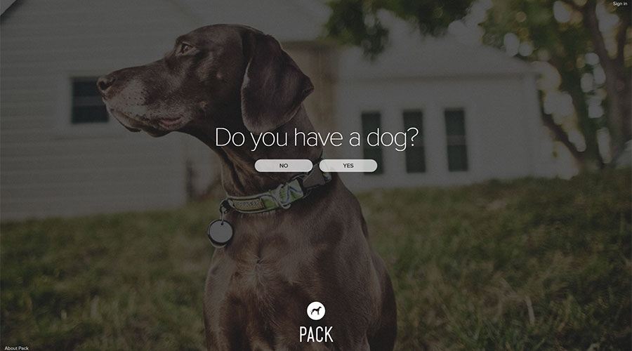
PACK is similar to MOON in many ways – full-width photography, simple layout, unspecified purpose. One of their biggest traits in common in fact is the sense of wanting to know what you’re looking at. This site, as with MOON, allows user engagement to drive interest, and an open questionnaire at the landing page guides you through a few steps before you’re met with the screen as seen below. Importantly, however, it asks you to sign up as part of the pack, cleverly joining attractive and easy designs with a feeling of community and taking part in something that’s a little bit confusing, a little exciting.
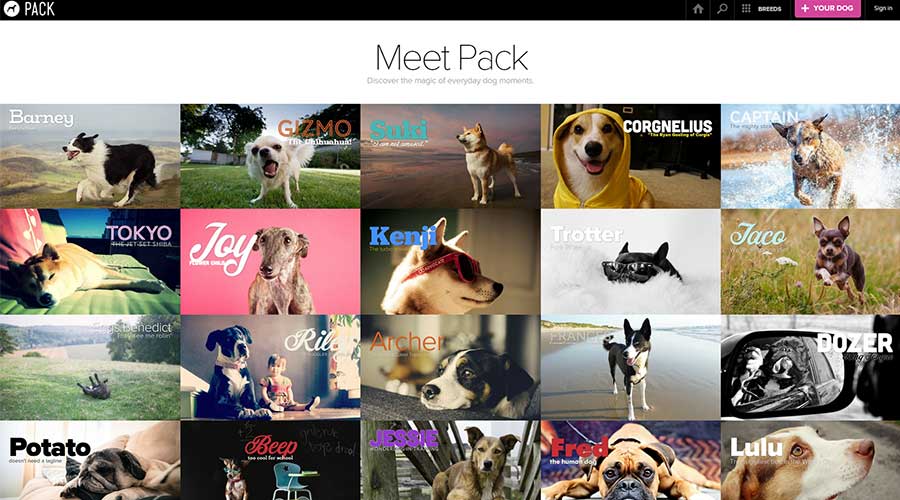
As for the design of sub-pages, this site is just beauty on a screen: simple, easy to navigate, clear, engaging. As you click through, you’re met with a world of Instagram for dogs. The site’s target audience is dog owners and lovers, and the owners utilise a sense of communal appreciation of the subject through vivid photography and personal interaction. I think what primarily draws me to the design, however, is the boxed feel. Through the rise of smartphones and apps, it has been well documented that our minds are becoming attuned to that way of information presentation, and so this site keeps it simple, keeps it obvious, which balances the confusion of not really knowing what on earth the point is.
3. BBC
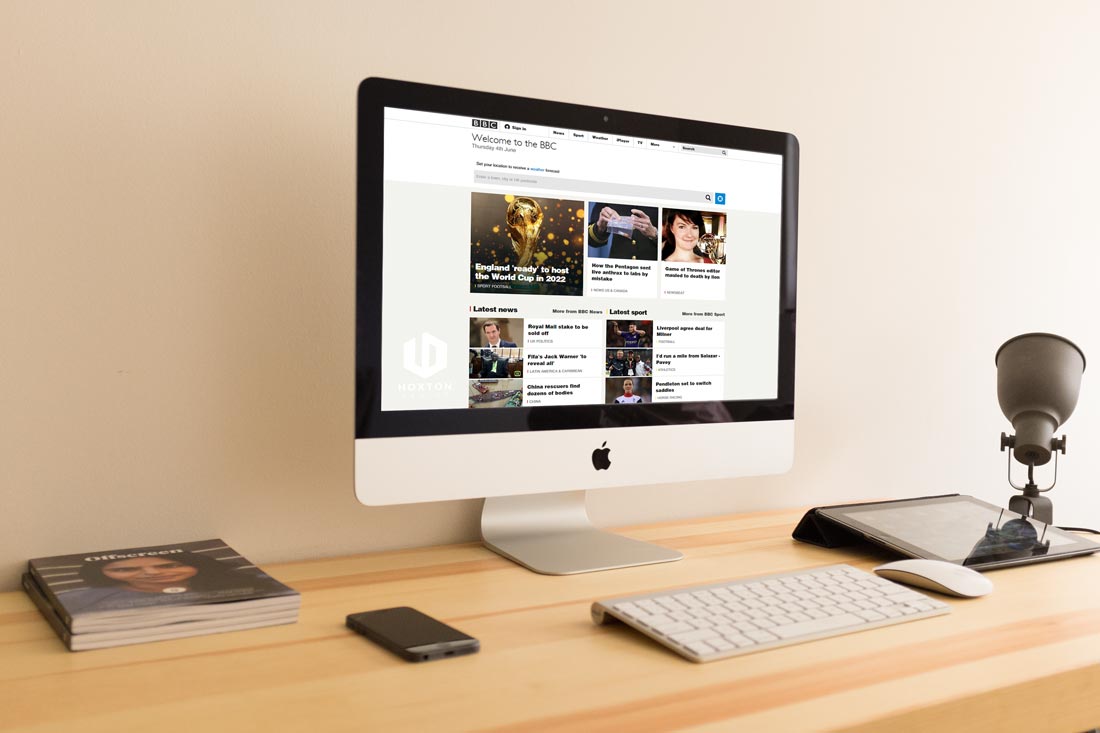
Something I really like about BBC’s website transformation is their commitment to trial and error. It wasn’t so long ago that they updated their old, tired website to a fresh, catchy scroll-bar style. The downside was that, well, there were a lot of downsides to it. It was hard to reach the top stories of subjects you were interested in, especially if you hadn’t visited the site before. When you hovered over a title, new headings would appear, often causing you to click on the wrong article. But they’ve kept designing, and they’ve kept developing, and each step along the way they’ve asked the user to check out the coming design and give them feedback.
Well, our vote’s in and we like it. So much of what’s important in a design, particularly when it is for a site so pigeonholed into a purpose like the BBC, is met on this home page. The topics are clear, the navigation is simple, good imagery is used to enhance article interest, and it even provides the sense of personalization by offering a ‘local weather’ app at the top. We wait with baited breath to see when the development stops.