Google’s going mobile. Well, more mobile. They’ve just released what is potentially the biggest algorithm change we’ve seen since Google began. The exciting thing about this change is that, unlike Penguin and Panda, the rewards are for the side of websites that most developers were looking at already anyway. And the sites that are in for a drop? Users were unlikely to spend much time on them as it was. This change has been a long time coming and, if you’re not ready for it yet, buckle up.
A Tide of Change
A couple of months ago Google told us that a wave was about to sweep the steady shores of the Internet and that, should grains of sand be attempting to avoid the tide of change, they would be pulled down. In this melodramatic metaphor I am of course referring to algorithms, websites and SERPs – the three pillars of Search Engine Optimisation and the keywords that spring up in many articles about Google.
What makes our current situation different, however, is that Google warned us of the exact date of this release: 21 April 2015. Webmasters had known that something along these lines would likely roll out, but it is the scale and ominous tones Google had relayed that was surprising.
A Brief Mobile Timeline
In July last year, Google told us to make sure sites were available to all users regardless of device, and that this would be shown to searchers in the SERPs. A similar message came along in November in a glaring signal of what was to follow this year. Around all this came App Indexing, meaning the link between mobile use and User Experience was about to become more than just apparent – it was about to become distinct, and therefore a ranking factor. So on 26 February this year, when Google told us the following, we were less surprised by the fact, more so by the scale.

“Starting April 21, we will be expanding our use of mobile-friendliness as a ranking signal. This change will affect mobile searches in all languages worldwide and will have a significant impact in our search results. Consequently, users will find it easier to get relevant, high quality search results that are optimized for their devices.”
The statement confirmed that previous updates simply allowed users a better view of the type of website they were likely to see, whereas this change would mean the importance of that sort of stamp would decrease as search results would favour those sites giving users the experience that Google expects.
It’s All About The User
It must be said that this change goes hand-in-hand with recent comments by the Google heirarchy, reminding website owners that the search engine is here to serve the user, not the site.
The way that mobile has integrated itself into daily aspects of society is through the effective method of usability. We don’t want to find it difficult to achieve a task that should be relatively simple – in fact we sub-consciously reward (whilst frequently denouncing) technology making decisions for us. It is this fundamental drive that has been seen in humanity over the past few years that in itself drives Google to use mobile-friendliness as a ranking factor.
This philosophy has been behind the last couple of major updates, namely Penguin and Panda, albeit slightly less directly. Google wanted to ensure that, whereas SEO in the dark old days had revolved around mass link building or keyword stuffing, sites were rewarded for providing users with a relative and useful experience.
So links began to be ranked on relativity to the subject and quality of the origin site, and frequently sites with high-quality but low volume of links saw improvements. This moved into content, where Google saw keyword stuffing as a major hurdle in providing the correct referrals to a searcher. And so webmasters started investing heavily in decent, useful content as opposed to paragraphs of keyword-inclusive nonsense.
This all added to the rise-and-rise of (quite correctly) user domination, and was a perfect precursor to what we’re seeing today.
Mobile Factors on Desktop
Some major factors we know to affect mobile usability, like text size and spacing, section layouts, page speed, and navigation (like menus) are actually more important in desktop than we pay credence to, and I think that, despite what Google says to the contrary, we will see indirect links between this new algorithm update and desktop results.
Google claims that, for now at least, this update will only affect Mobile searchers, but we must not miss the fact that it is the impact of this on your website’s use that will have an impact on even your desktop showings.
For example, if company AAA has a mobile-friendly website and Google rewards them for this, then their rankings on mobile will increase, organic page views will likely go up, and because Google has ranked them on this mobile-user experience, it can be assumed that the user is likely to lend a low bounce rate and a higher time-on-page result on average.
Now, as SEO professionals will tell you, these are both factors in common SERP results, so indirectly this algorithm update is bound to have an impact on your desktop rankings, even if it is not a direct consequence of this particular algorithm crawl.
How Does App Indexing Fit In?
Another side of this update to Google’s crawl is that of the App indexation. Whilst not an intrinsic part of this particular change, it is certainly a good foundation off which to view the shift in the search engine paradigm. So what, in essence, is it? Google is building a database of Apps from the Play Store similar to the way in which they understand websites. This means that if your company’s app is linked to your website, you might start appearing in the App column of Google’s SERPs – allowing users (specifically Android users) to gather information directly from your app.
The benefits of this are fairly obvious in terms of downloads, user-retention etc. It is worth highlighting though, as it is just the sort of indication Google has been giving us that the mobile is where it’s at in terms of the Internet’s future. I would be surprised if, moving forward, there was not a clear correlation between App-link clicks and even App-downloads, and that of a company’s desktop and mobile site rankings, so long as the App is indexed.
So 21 April 2015 Is Here
What we can expect today has been covered broadly and fairly consistently. What do you need to do? Have your site ready. If your website is still not mobile-friendly, start making it so. Don’t hit the panic button yet because not only will this roll-out be gradual, there are rumours that it will be live, in which case changes should get picked up fairly quickly and demonstrated in the SERPS.
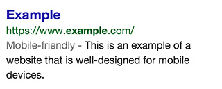
To add to the significance of the update is the fact that Google itself is gifting tools to website owners to check whether their site passes the test. Because the update focuses on individual page usability as opposed to site-wide mobile-friendliness, you can type specific pages into Google’s checking tool here. Google Webmasters can also check site-wide status via the Webmasters Tools page.
Keep in mind that if your content is good enough, you may still get mobile rankings, but for user-experience if nothing else make use of the tools linked to above, and get yourself sorted. Make your website a pleasure on mobile devices and your rankings and subsequent user visits will be grand.